
The name leads.
Early concepts had personality, but the lettering needed more presence at a distance. Bigger type, stronger contrast, and a cleaner hierarchy put Angel Babies where it belongs: first in the viewer's mind.
Brand Story · Angel Babies
Angel Babies began with a question dog owners kept asking: “What do you use for your dogs?”
The answer grew into a mobile dog-supply business. Before it could take that idea on the road, it needed a brand people could see, understand, and remember.
Let’s Talk About Your Brand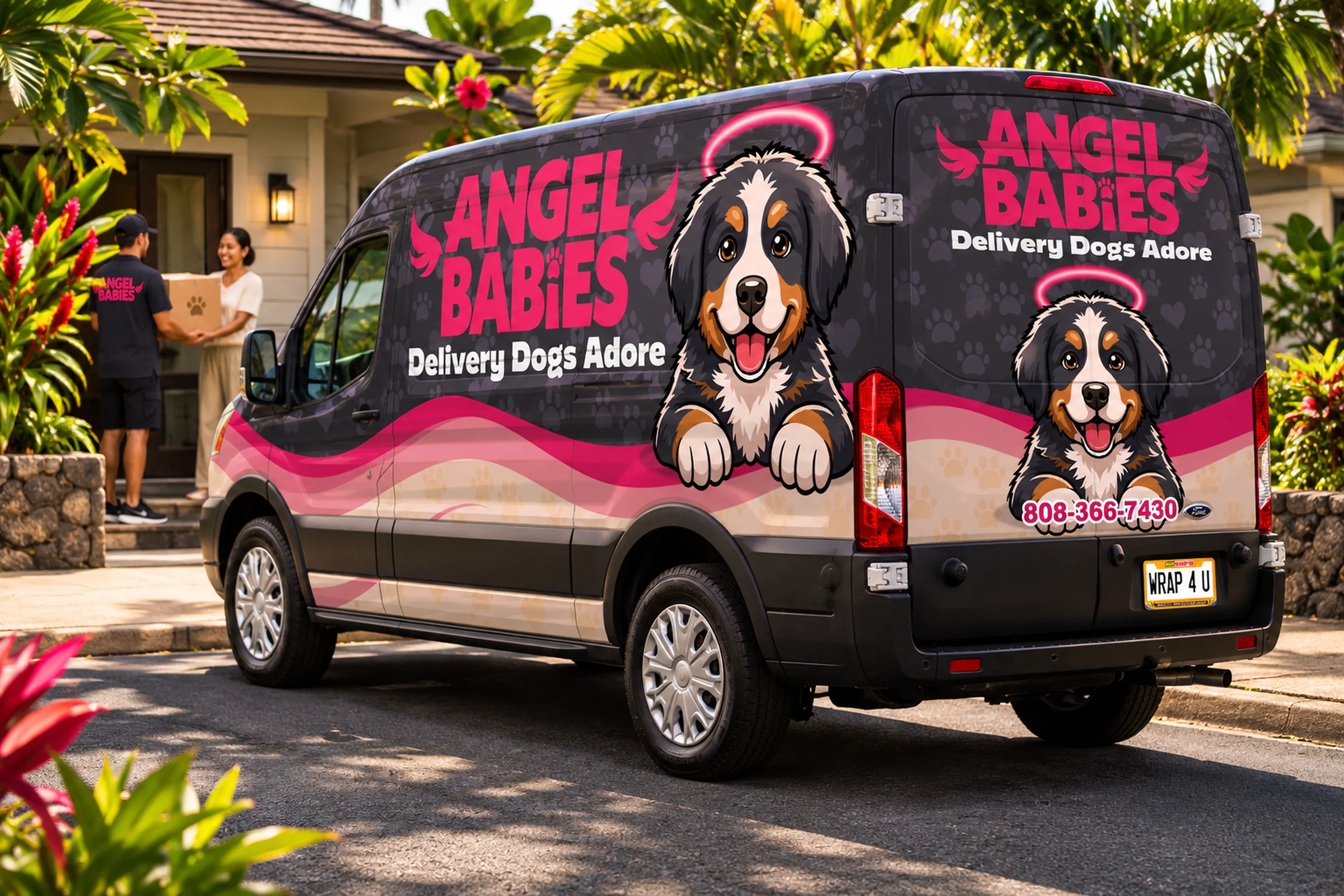

The project
Their clients already trusted them with their dogs. Could that trust become a brand people would recognize on the road? Angel Babies came to 808Wraps with a new mobile dog-supply idea and a very personal point of view. Together, we gave it a look that feels as joyful as the dogs behind it.
Give Your Fleet a StoryThe heart behind Angel Babies
Dog-training and boarding clients kept asking the owners a simple question: What do you use for your dogs? They wanted the shampoos, chews, toys, food, and training products the family actually trusted.
Their daughter saw the opportunity: why not bring those recommendations directly to other dog owners? Angel Babies grew from that question into a mobile dog-supply business built around products its owners know and love.
With six dogs of their own, this was never going to feel like a generic pet store on wheels. The brand had to carry the same affection and experience that inspired the business.
Brand Lift Off
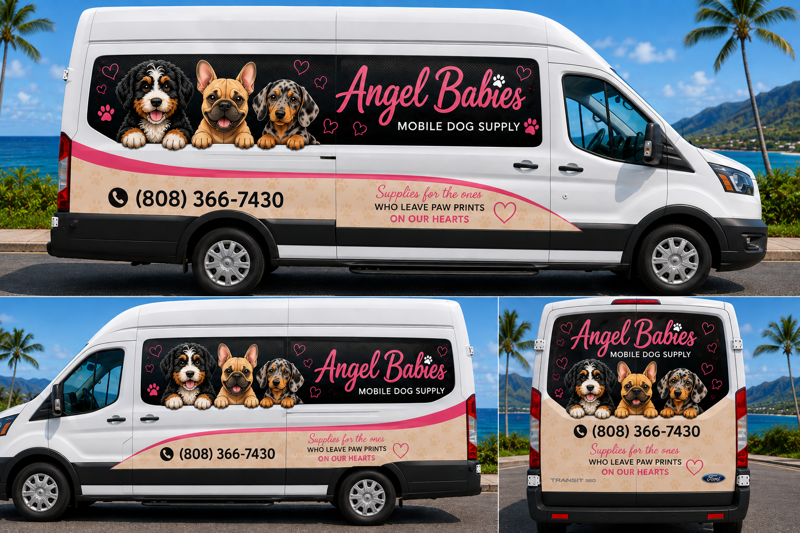
The client brought an AI-generated mockup that captured the spirit of Angel Babies: dogs, pink, hearts, and a playful delivery idea. It gave us a useful starting point. During the FleetReview™, we asked a different question: what would a stranger see, understand, and remember while the van was moving?
Client’s AI mockup
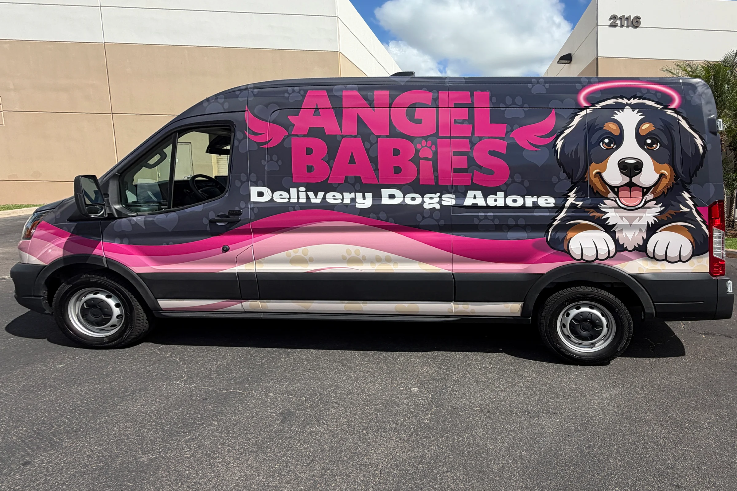
The finished Angel Babies wrap
The starting concept showed us what the family loved. Our role was to turn that inspiration into a clearer hierarchy: make Angel Babies readable from farther away, give Bernie one memorable starring role, and let the line explain the service in an instant. Bring us your AI mockup—or a sketch, photo, or idea. We can build from it and guide the decisions that make the design work on a real vehicle.
Bring Us Your AI MockupEarly concepts had personality, but the lettering needed more presence at a distance. Bigger type, stronger contrast, and a cleaner hierarchy put Angel Babies where it belongs: first in the viewer's mind.
Patricia, the owner of Angel Babies, connected immediately with the dog in one of the early directions. It was her own dog—her heart dog. We paired that emotional center with the stronger visual hierarchy, giving the brand a character people can recognize beyond the van.
“Delivery Dogs Adore” tells a newcomer who the service is for and what makes it fun. It turns the familiar excitement—or commotion—around a delivery into a promise made for dog people.
Inside the identity
Already turning heads
Hot-pink lettering, Bernie, paws, hearts, wings, and a halo now work together across the van. The personality is unmistakable; the name remains clear. Every detail has a job, from the first glance to the closer look.
Patricia told us neighbors had approached them to ask about the van, people watched it pass, and existing clients at classes wanted to know more. In our installation follow-up, she described her experience with 808Wraps as five-star and said the finished wrap exceeded what she had imagined.
The vehicle is ready to introduce Angel Babies wherever the business goes. Its impact begins with the moment someone notices, smiles, and remembers the name.
Delivery Dogs Adore.
Let’s Talk About Your FleetAngel Babies didn't start as a logo or a delivery van. It started with a question its owners kept hearing from dog-training and boarding clients: “What do you use for your dogs?”
Shampoo. Chews. Toys. Food. Training and sport products. Their customers trusted their experience and wanted to know what they actually used and recommended. Eventually, their daughter asked the obvious question: Why not sell it?
That idea became Angel Babies—a mobile dog-supply company created to bring products its owners know, use, and love to dog owners across Oʻahu. But before Angel Babies could take that idea on the road, it needed something just as important as inventory. It needed a brand.
Angel Babies wasn't created by people simply looking for another product to sell. Dogs were already part of their lives and their work. With six dogs of their own and years spent around training, boarding, pet dogs, working dogs, and sport dogs, their product philosophy was simple: sell the things they would confidently use with their own dogs.
That gave us the foundation for the brand. This couldn't feel like a generic pet store on wheels. The personality needed to communicate the affection, experience, and enthusiasm that created the business in the first place.
Angel Babies was a memorable name. But a memorable name alone doesn't tell a stranger what a company does. During the FleetReview™, we looked at the identity the same way someone would experience it in traffic: quickly, from a distance, and without any previous knowledge of the company.
The early concepts had plenty of personality, but some of the typography and visual hierarchy made the brand harder to recognize from farther away. A commercial vehicle doesn't get the luxury of a long explanation. The name has to register quickly.
We pushed the identity toward bigger, bolder lettering, stronger contrast, and a cleaner hierarchy designed to make Angel Babies the first thing people remember. It made a difference that is easy to overlook on a computer screen: a beautiful logo still has to work when the audience is moving.
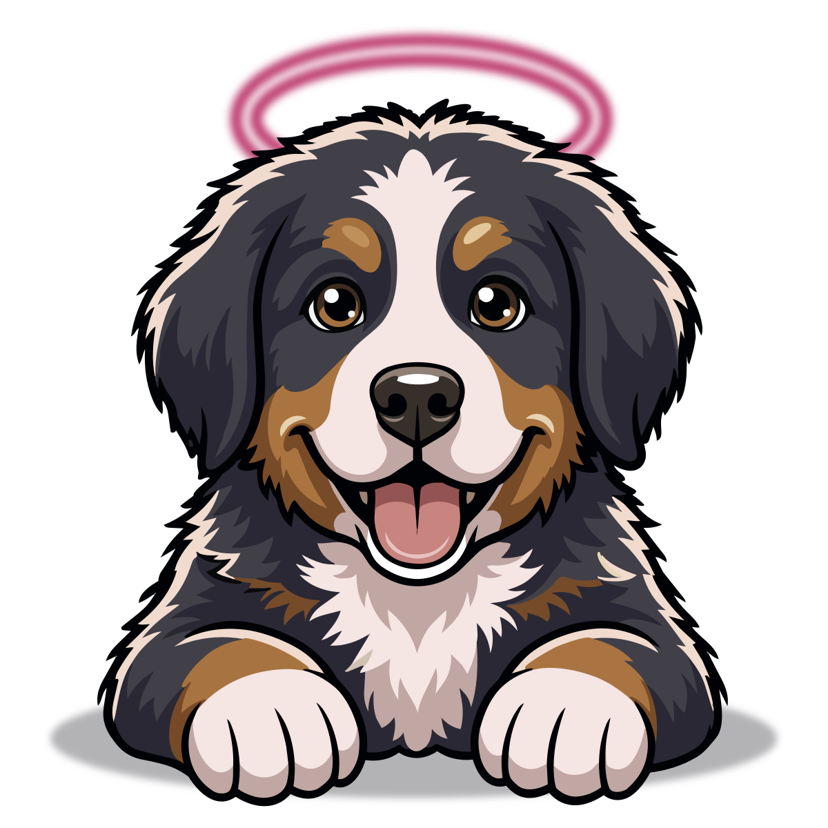
Patricia, the owner of Angel Babies, immediately connected with a dog featured in one early direction. There was a reason: it was her dog, her “heart dog.” Another concept had stronger typography and visibility, but that first dog carried the emotional truth behind the brand.
Rather than choose one direction over the other, we combined what mattered most from both. The stronger brand hierarchy stayed, and Patricia's heart dog became the face of Angel Babies.
With a halo, expressive personality, and room to grow as a recognizable brand character, Bernie became more than decoration on a vehicle. He gave Angel Babies a character people could associate with the company after the van passed them.
There was still one problem to solve. If someone saw the words Angel Babies for the first time, would they know what the company did? Not necessarily. The tagline had to connect dogs, love, and delivery. The answer became: Delivery Dogs Adore.
It's simple enough to understand in traffic, but there is a joke hiding inside it. Dogs aren't exactly famous for greeting delivery people quietly. Angel Babies flips that relationship around: these are the deliveries dogs are supposed to get excited about.
The line gives the brand category clarity without reducing the company to a list of products. It reinforces the emotional reason people buy those products in the first place: they love their dogs.
The finished identity brings those decisions together. Bold hot-pink Angel Babies lettering stands against a dark field for distance recognition. Bernie anchors the design as the mascot. Paw prints, hearts, wings, and halo details reinforce the personality without competing with the name. Sweeping pink and cream graphics create movement across the vehicle.
And underneath it all: Delivery Dogs Adore. What began as an idea for a mobile dog-supply business became a visual identity designed to work wherever Angel Babies goes. A brand on the move.
Have a business idea that’s bigger than the logo you started with?
808Wraps helps businesses turn vehicles into recognizable brands, starting with what people should see, understand, and remember.
Let’s Talk About Your Brand